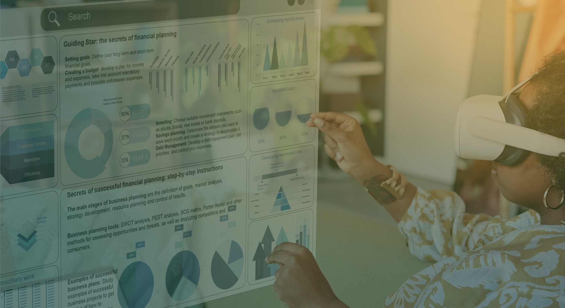
The Future of Impact Storytelling: Leveraging AI and Data Visualization
The future of impact storytelling is being shaped by two technologies: artificial intelligence and data visualization. If you’re still writing long-form reports or relying on static graphs, you’re behind. Stakeholders now expect transparency, clarity, and real-time insight. This shift isn’t just about using new tools—it’s about changing how you communicate results.
Below is how you can rethink your strategy using AI and visual data tools.
- Reports Are Outdated. Live Dashboards Are In.
Most stakeholders don’t read annual reports. They skim for graphs or search for their favourite project. What they want instead is fast, clear answers.
- Build interactive dashboards that show project progress.
- Use filters to break down data by location, timeline, budget, or beneficiary group.
- Replace static pie charts with bar graphs that update as new data comes in.
- Geo-mapping tools like Mapbox or Google Maps APIs can show reach per region.
Tip: Use Google Looker Studio or Tableau Public to create live dashboards without custom coding. These integrate easily with Google Sheets or Excel.
- AI Is Writing the First Draft for You
AI is helping teams produce faster, more consistent reports.
- Tools like ChatGPT or Jasper can generate first drafts based on prompts or raw data.
- Natural Language Generation (NLG) can translate spreadsheets into human-readable summaries.
- AI transcription and summarisation tools like Otter.ai or Descript reduce the time spent processing interviews or field notes.
Tip: Always edit the AI-generated output. Use it to speed up workflows, not to replace human oversight.
- Stories + Data = More Powerful Messages
Good stories engage emotions. Good data builds trust. When used together, they’re more persuasive.
- Pair field stories with project KPIs. For example: “Fatima’s clinic visit was part of a programme that served 12,000 mothers across four districts in 18 months.”
- Use timeline graphics to show before/after comparisons, or intervention touchpoints.
- Add short video snippets or voice clips to humanise the data without bloating the format.
Tip: Keep case studies under 200 words. Let the data do most of the talking.
- Data Isn’t Always the Full Story—Say So
Stakeholders want proof of impact, but not at the cost of honesty. AI tools can unintentionally fill gaps with made-up patterns. That’s risky.
- Declare where your data is incomplete or estimated.
- Avoid over-aggregating: “90% success” might hide that results only came from one region.
- Check AI summaries against your source data—never assume they’re right.
- Don’t use AI image generators for storytelling unless labelled. It can mislead.
Tip: Add a simple “Data caveats” section in your reporting. It builds credibility.
- You Can Build a Lightweight Stack with Off-the-Shelf Tools
You don’t need custom-built tools or big budgets to get started.
| Use Case | Tool | Notes |
| Drafting reports | ChatGPT, Jasper | Feed data tables + prompts for summaries |
| Visual storytelling | Canva, Flourish, Venngage | Good for infographics, timelines, static visuals |
| Dashboards + tracking | Looker Studio, Tableau, Power BI | Connects to spreadsheets, surveys, or CRMs |
| Automation + alerts | Zapier, Google Apps Script | Sends updates based on new data entries |
| Survey + feedback analysis | Typeform + Google Sheets + GPT | Clean input + AI-generated sentiment summaries |
| Real-time map visualisation | Google Maps API, Mapbox | Visualise reach, delivery points, hotspots |
Tip: Pick two tools to start: one for drafting content (e.g., ChatGPT), and one for visuals (e.g., Canva). Build up from there.
- Rethink What Success Looks Like
The future of impact storytelling won’t be measured in how many reports you write. It’ll be judged by how clearly people understand your results.
Ask:
- Can your programme officer explain the data in 2 minutes?
- Can a donor see what changed without reading the report?
- Can a fieldworker use the same dashboard to track their progress?
If not, your tools may be producing information, but not insight.
Focus Keyword: The future of impact storytelling
To keep up with how people consume and evaluate information, shift to faster, clearer, more visual reporting. Use AI to reduce grunt work. Use data to make your story harder to ignore.